WEB DESIGN FOR RENEWABLE ENERGY COMPANIES
Clearstone Energy is a UK developer of large-scale solar farms and battery storage assets. The business has grown since setting up in 2016 and needed a clear, differentiated and compelling web presence to support growth.
THE CHALLENGE
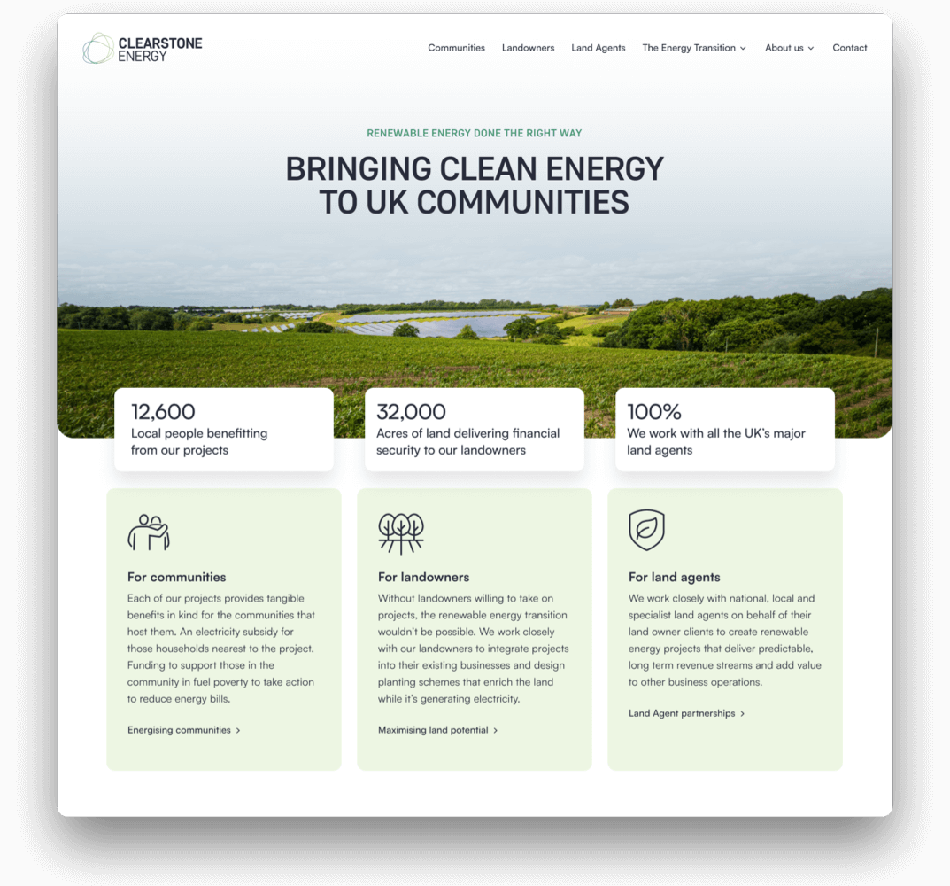
Driven by the need to reduce carbon emissions, the UK’s electricity system is undergoing a profound transformation.
The transition to a low carbon energy network in the UK is, at its heart, about people. The thousands of landowners who will host the solar or wind farms and battery facilities. The millions of people that will buy their own solar panels, batteries, EVs and heat pumps. The tens of millions of people for whom solar panels and wind turbines will become a visual part of their everyday lives.
Clearstone Energy needed to demonstrate that they understand their priorities, responsibilities and needs. There was a need to present greater substance and more empathy for their admirable courage in supporting projects.
USER-CENTRIC WEB DESIGN
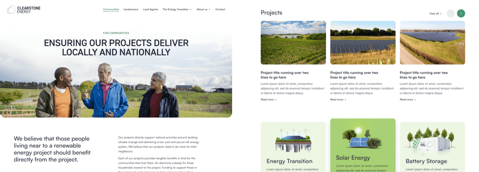
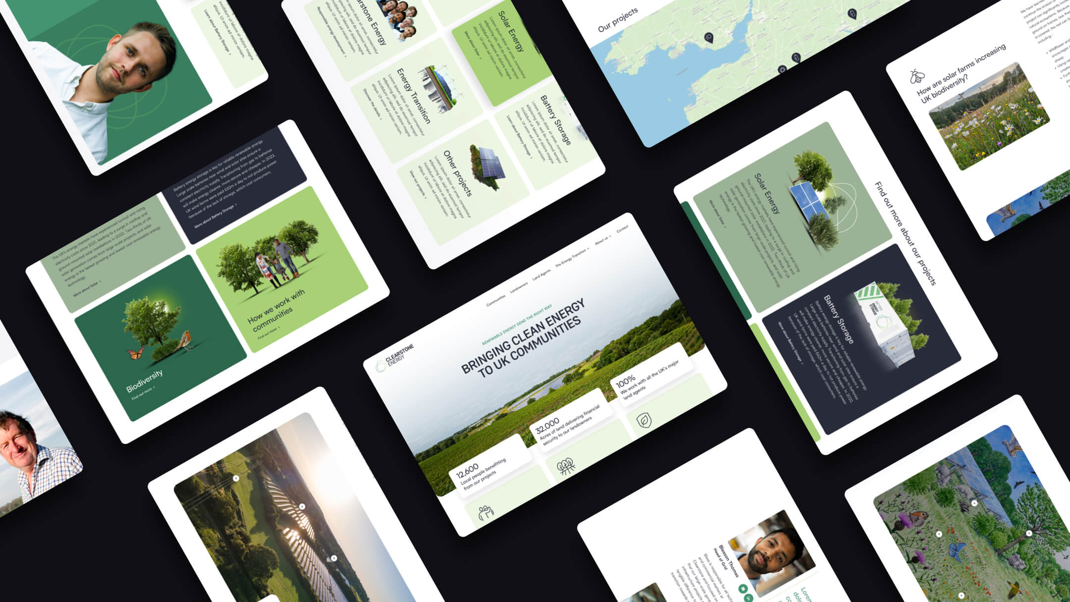
The site was restructured to prioritise tailored content for primary audiences – communities, landowners and land agents. This is supported by landing pages that explore the need for renewable energy and Clearstone’s sustainable solutions to resolving the national challenges of zero-emission power and energy security.
A SLEEK USER EXPERIENCE
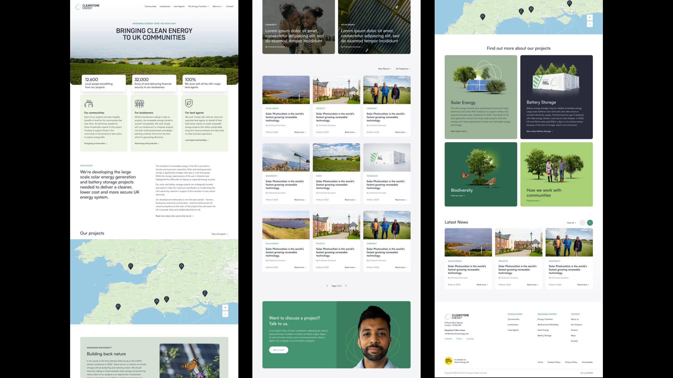
Micro-animations across the UI design work in combination with rounded elements and people-focussed imagery to make information discovery an engaging experience. Content, written with a human and truthful tone of voice, positions Clearstone as responsible pioneers helping shape the UK’s future energy systems in a way that works for everyone.
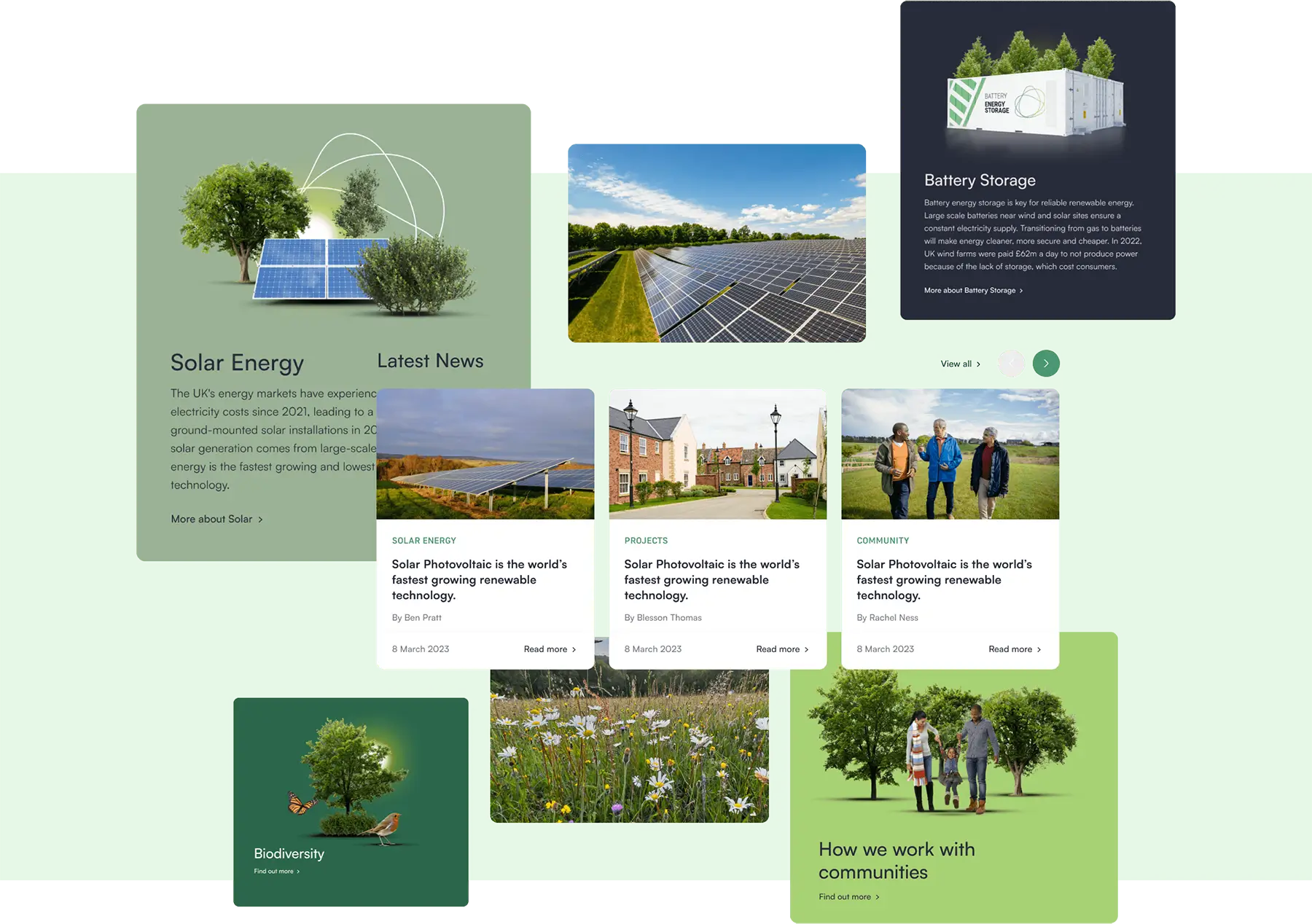
A FLEXIBLE, FUTURE-PROOF DESIGN SYSTEM
Ronins is a strong advocate of establishing design systems for clients, as brand standards specifically for digital can be expressed more fully and effectively.
Rather than delivering collections of web page templates, we create a thoughtful design language in which foundations of colour, typography, grids and animation filter into modular content blocks that content teams can use to build their own unique pages. The result is a website that can present a wide variety of content beautifully, while fostering a consistent, cohesive and engaging user experience.
We have looked at the site many times and we love the look and feel of it. You have made us look like a million dollars!
PURE HYDRATION