SITEFINITY WEB DESIGN
Orbus Software is a leader in Enterprise Architecture software, trusted by global brands to guide their digital transformation journeys. Their platform rebrand presented the perfect opportunity to create a more user-centric site that is easier to manage.
THE CHALLENGE
Their previous site wasn’t performing. It wasn’t optimised for organic search and struggled to convert visitors into prospects. It had outgrown itself, with elongated user journeys and page layouts that didn’t support the content well.
The CMS was labour intensive, with a multitude of design decisions to be made at every turn when creating page content.
It was expensive to maintain as content updates that didn’t fit within rigid page templates had to be conducted by the previous development agency.
CHANGE DELIVERED
- User Experience Design
- User Interface Design
- Web Design
- Design System
- Sitefinity CMS
USER-CENTRIC WEB DESIGN
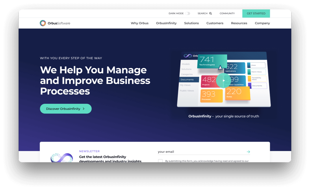
The site was restructured to increase relevance to Enterprise Architecture practitioners and C-Suite decision-makers. With the site more navigable to specific audience goals, the website is now more relevant, highlighting Orbus Software’s strengths that differentiate them from their competitors
UX IMPROVEMENTS
Analytics revealed a need for a greater depth of information on product and solutions landing pages. Blog articles that serve as primary organic entry points now link to relevant resources and solution-oriented content.
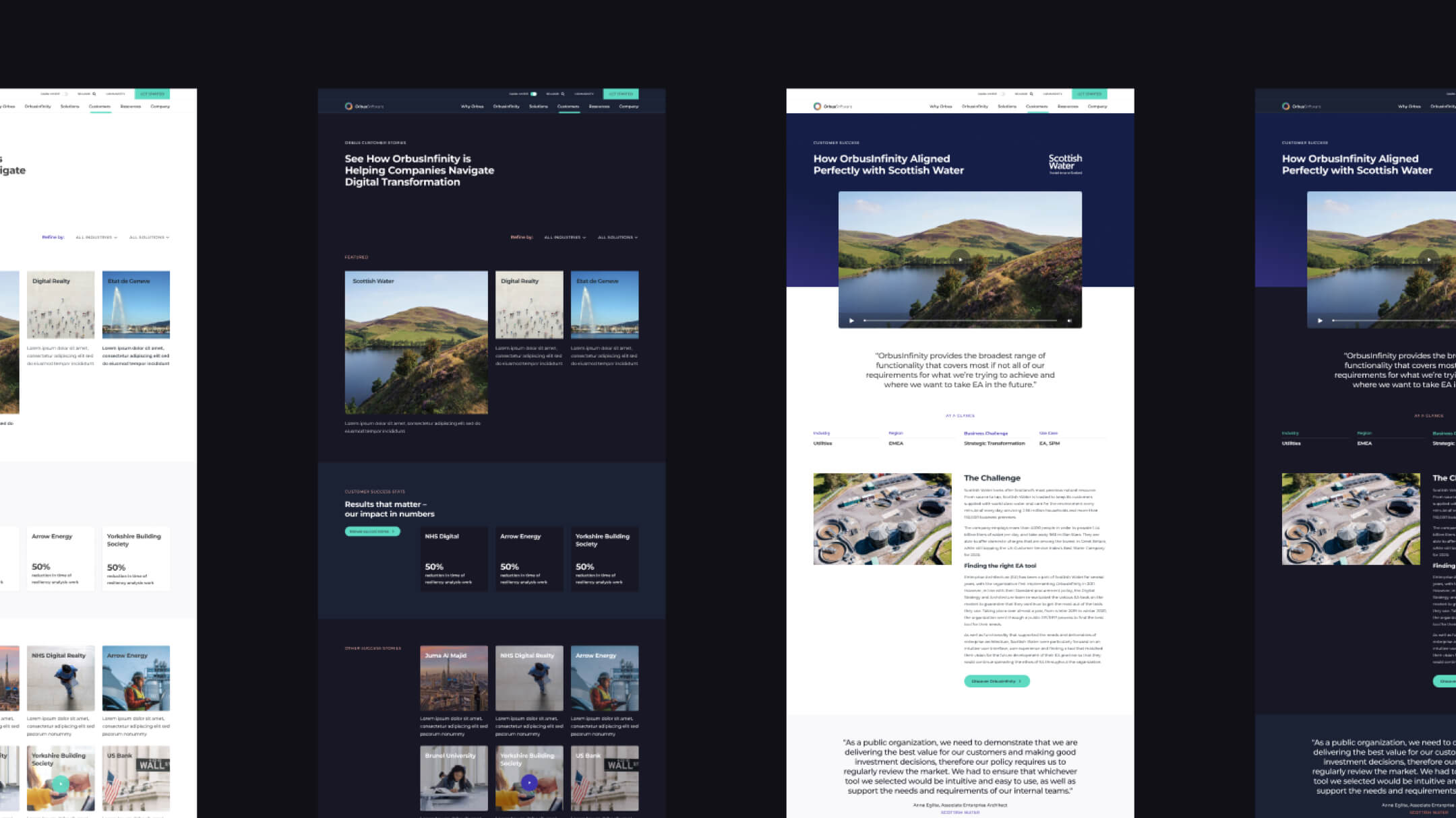
Greater emphasis has been placed on social proof – evidencing credibility in the form of reviews, testimonials, quantifiable metrics and customer stories.
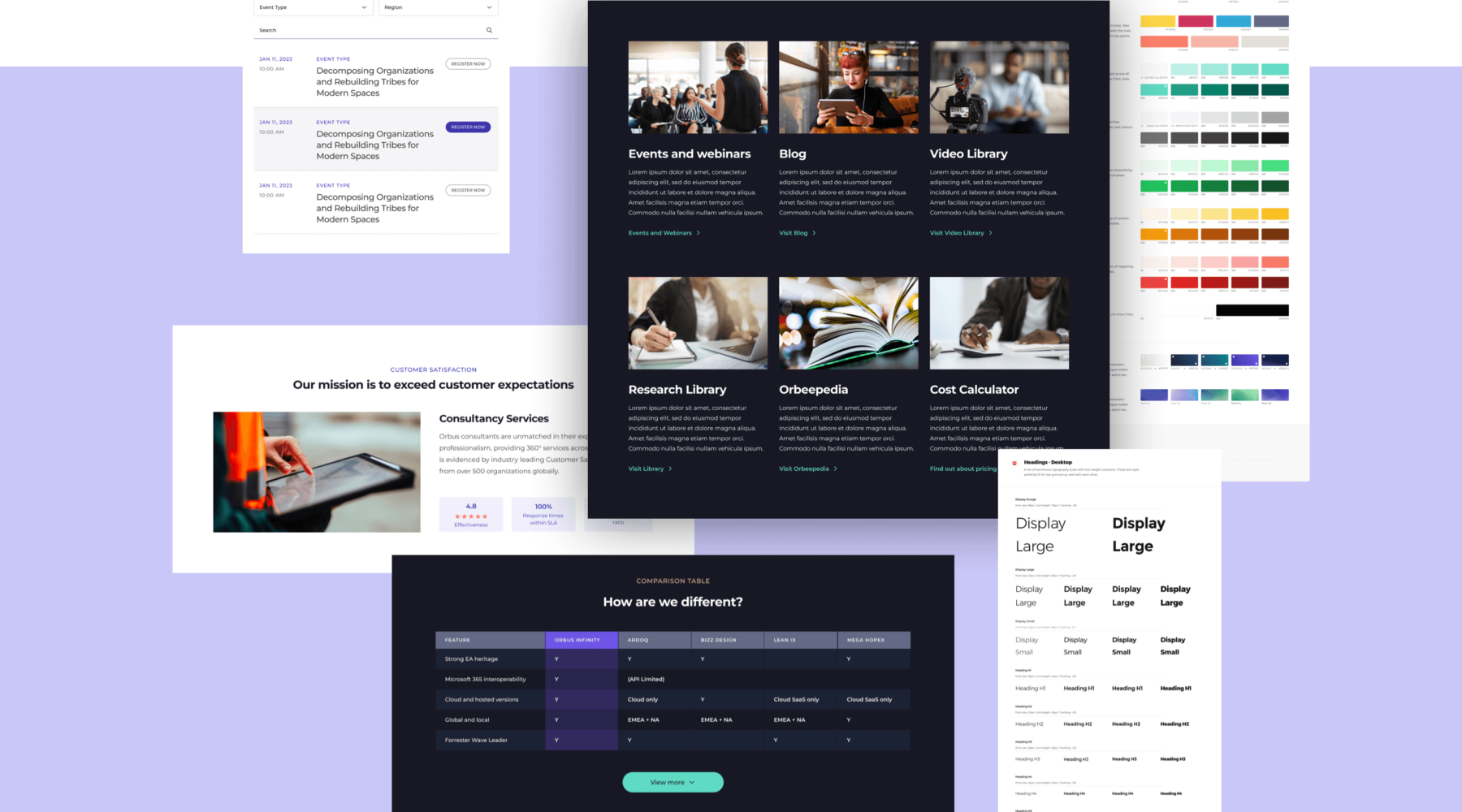
A STELLAR USER EXPERIENCE
Meaningful user journeys that are optimised to specific key audiences have now been introduced. A contemporary web design, combined with content rewritten for improved clarity by removing jargon and buzzwords, presents Orbus as genuine industry leaders and a truly customer-centric business.
SITEFINITY CMS
Enhancing an enterprise CMS
The previous iteration of the website presented the Orbus content team with an overwhelming number of layout options within the Sitefinity CMS. Lack of documentation, guidelines and best practice also meant that each member of the Orbus team was using the CMS in different ways adding to the content confusion. As a result, creating new pages was cumbersome and time-consuming for the internal teams, whilst the pages created lacked brand consistency and quality control. The CMS became several mini sites, depending on who worked on different sections.
With the new website, content sections are pre-defined components that can be quickly and simply added, populated and re-ordered. We took great care to define content types to speed up the process of page creation while ensuring that content is displayed consistently across the site.
Thorough documentation and limiting some of the CMS formatting options also aided the internal management of the stakeholders.
In sum, we had to take a holistic approach to rebuilding the CMS taking into account the day-to-day of internal teams, prioritising an intuitive and optimised user journey, respecting and adhering to brand guidelines and giving the client freedom to be self suficient moving forward.
We have introduced considerable cost savings, as Orbus are no longer reliant on a development agency to perform regular content updates. They now have the ability to create their own pages or new microsites using a component-based approach that has the flexibility to present content in the best way possible.
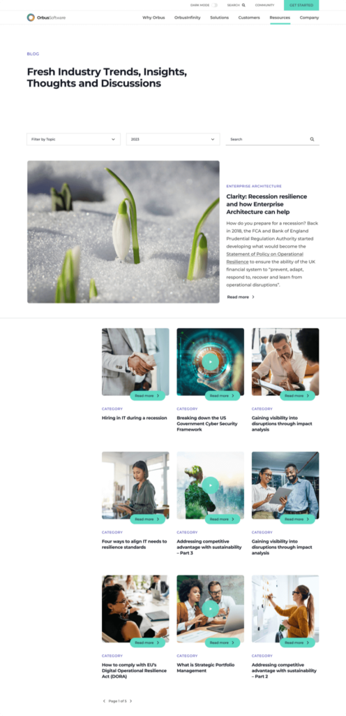
SEO FROM THE GET GO
With a solid domain authority and more than 20K backlinks, SEO was a critical consideration from start to finish. The previous site was already ranking highly on many target keywords but it was clear that the site architecture, page structure and confusing navigation was holding the site back. We started off by reviewing the site architecture and ensuring all pages were flowing and connected appropriately. The responsive component library is designed to present high-quality, relevant and valuable information with a focus on readability and logical, intuitive internal linking that not only enhances the user experience, but contributes to better search engine rankings.
Through improvements to page content and visual hierarchy, user engagement metrics such as bounce rate and time spent on page will positively impact the site’s overall ranking. Technical SEO considerations ensured page load times were also minimised.
We also created a new section of the site, solely dedicated to SEO in the shape of a wiki. This allowed Orbus to build upon valuable content for its users whilst building a well structured and optimised new section to rank for key terms.
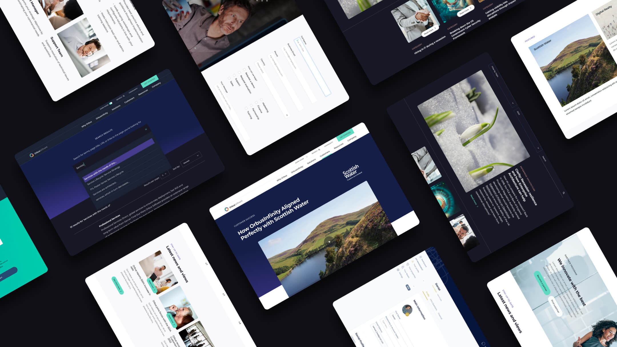
A FLEXIBLE, FUTURE-PROOF DESIGN SYSTEM
We provided a comprehensive component library that streamlined their internal processes – empowering their content team to create seamless, beautiful experiences better and faster.
Rather than delivering collections of web page templates, we’ve established thoughtful design system in which foundations of colour, typography, grids and animation filter into modular content blocks that Orbus content teams can use to build their own unique pages. The result is a website that enjoys the flexibile capability of displaying a wide variety of content, while fostering a consistent, cohesive and engaging user experience.
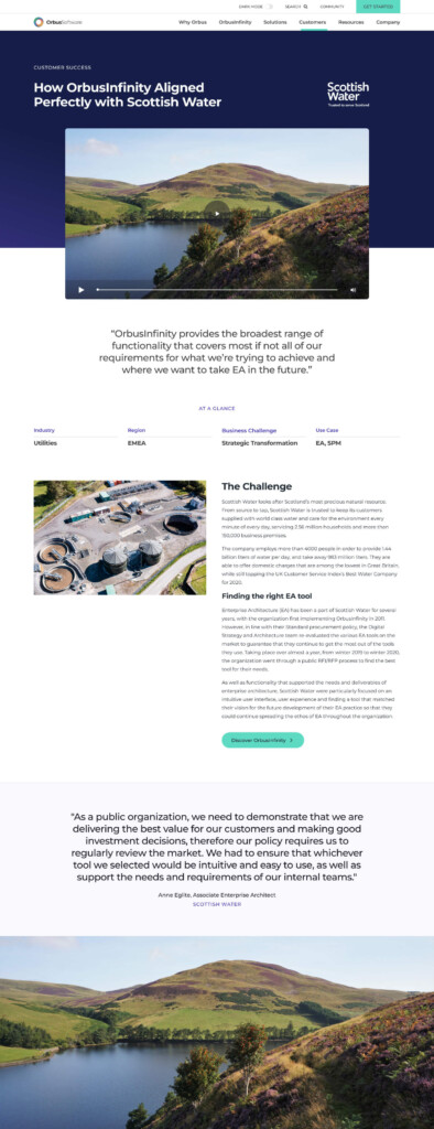
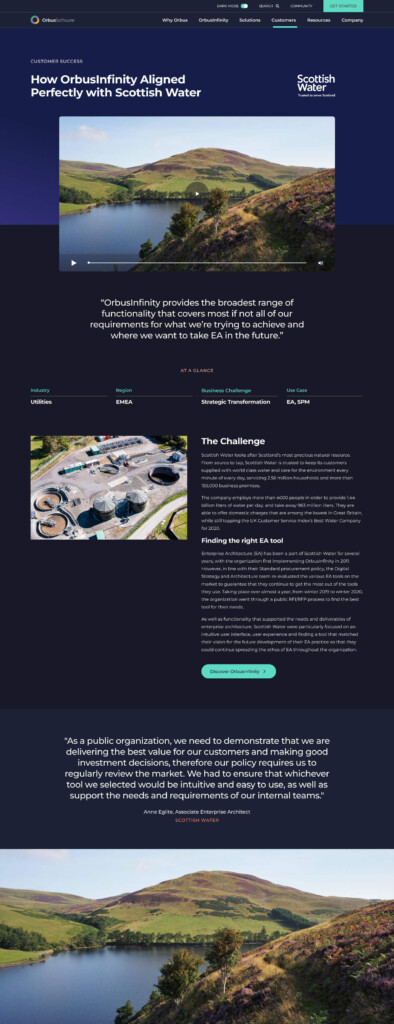
LIGHT AND DARK MODES
Light and dark modes provide comfortable browsing experiences in differing light conditions.
Light mode offers a clean and bright interface, which is suitable for well-lit environments or during the daytime.
Dark mode presents a darker colour scheme that reduces eye strain and provides a more relaxed browsing experience, particularly in low-light environments or during nighttime.
These contrasting modes not only enhance the visual appeal but also prioritise user comfort and accessibility, ensuring a seamless and enjoyable browsing experience for all.
