7 Ways to Boost Lead Generation with Landing Pages
Table of Contents
TLDR
This article uncovers seven proven strategies to boost lead generation capabilities in your landing pages.
A landing page is a standalone web page designed for a single call-to-action, often used in paid advertising to convert visitors into leads. It’s distinct from other website pages, lacking navigation links to focus visitors’ attention on the offer.
Effective landing pages aim to generate leads, convert leads into customers, improve user experience, increase website conversions, and measure performance.
Key strategies for making landing pages more effective include simple design, compelling headlines and images, easy-to-use forms, clear calls to action, social proof, search engine optimisation, and performance tracking and testing.
An example of an effective landing page is Kernel for Figma, which uses a simple design, minimal copy, and product demonstration videos.
What is a landing page?
A landing page is a standalone web page that focuses on a single call-to-action, such as capturing a visitor’s information through a lead generation form. Unlike other pages on a website, a landing page usually has no navigation links, allowing the visitor to focus solely on the information and offers presented on the page.
They’re often used with paid advertising campaigns, such as Google AdWords or social media ads. By directing traffic from these campaigns to a targeted landing page, businesses can increase the chances of converting visitors into leads.
Effective landing pages can help businesses to achieve several important goals, including.
- Generating leads: By providing a focused and compelling offer and a clear and easy-to-use lead generation form, effective landing pages can help businesses to collect valuable information about potential leads.
- Converting leads into customers: By providing detailed and relevant information about a product or service and including clear calls to action, effective landing pages can help persuade leads to purchase or take a desired action.
- Improving the user experience: By providing a focused and engaging experience and removing distractions such as navigation links, effective landing pages can help improve the overall user experience.
- Increasing website conversions: By providing a targeted and well-articulated offer and making it easy for visitors to take a desired action, effective landing pages can help improve the overall website conversion rate.
- Measuring and improving performance: By tracking the performance of a landing page, businesses can measure the effectiveness of their offers and adjust their strategies to improve results over time.
Because they are incredibly targeted and laser-focused, landing pages are great for generating leads. The content on a landing page is typically related to a specific product, service, or offer, and the lead generation form is designed to collect information about the visitor’s interests and needs. This enables companies to get useful data about potential prospects and focus their marketing initiatives more precisely.
• • •
7 ways to make landing pages more effective
As ever, the key to maximising the performance of a landing page is to understand your target audience and their needs. Creating content that speaks to their pain points, motivations, and limitations is critical for a great user experience, but you can also take several key steps to make landing pages more effective, including:
1. Keep the design simple and focused
A landing page should have a clean, uncluttered web design that directs the visitor’s attention to the offer and the lead generation form.
2. Use compelling and engaging headlines and images:
Headlines and images on a landing page should grab the visitor’s attention and convince them to take the desired action.
3. Make the lead generation form easy to use
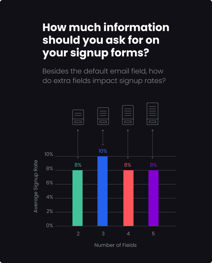
The form on a landing page should be easy to fill out, with clear instructions and a minimum number of fields to complete.
The composition of a form, including the number and types of fields it contains, significantly impacts its ability to convert users. For instance, research by Omnisend indicates that forms with three fields achieve the best conversion rates, averaging around 10%.

4. Include clear and compelling calls to action
The call to action on a landing page should be clear and prominent and should encourage the visitor to take action. Calls to action should be written with user benefit in mind – i.e. what they will get – rather than describing functionality. It can help to think about ending the sentence ‘I would like to…’ e.g. ‘Enquire Today’ instead of ‘Submit.’
5. Use social proof to build credibility
Customer testimonials, social media followers, and other forms of social proof, such as ratings or accreditations on a landing page, will help to build credibility and trust with the visitor.
6. Optimise the page for search engines
Be sure to include relevant keywords and phrases in the page title, headlines, and content to improve the visibility of the landing page in search engine results. Images that aren’t purely decorative should contain ALT tags that provide context.
7. Track and test performance
Tracking the performance of your landing page will help identify elements that are working well and those that need to be improved. You can then use this information to test different landing page versions for their copy, imagery and CTAs to see which combinations improve its overall effectiveness.
• • •
An effective landing page example
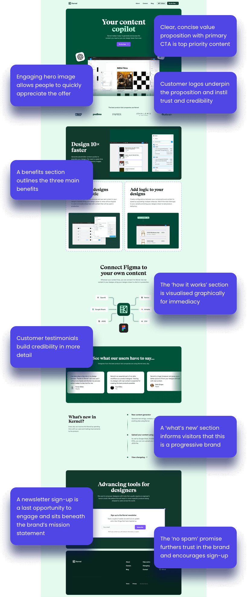
Data.to.Design is a plugin for one of our favourite design tools, Figma. It allows designers to generate and access content quickly. The page is copy light – containing approximately 500 words, presented no more than a paragraph at a time.
Overall, Data.to.Design employs several best practices for an effective landing page, particularly in its clear CTA, minimalist design, use of social proof, and user testimonials. However, directly incorporating a dedicated lead generation form on the page could further boost lead generation capability.

Clear Call-to-Action (CTA): The page has a clear and prominent CTA, “Try for free,” encouraging visitors to engage with the product directly.
Focused Content: The content is concise, focusing on the benefits of using Kernel for Figma users. It emphasises speed, ease of use, and integration with other tools, which are likely key considerations for the target audience. Throughout the page, videos showcase the product in action – demonstrating rather than describing functionality.
Minimalist Design: The page uses a simple colour scheme and plenty of white space, making it easy for visitors to navigate and absorb the information presented.
Use of Social Proof: Logos of well-known companies like John Lewis and Outbrain are displayed, suggesting that reputable businesses use the service. This can build credibility and trust with potential users.
User Testimonials: The inclusion of testimonials from users adds a personal touch and provides real-world examples of how the tool has been beneficial, which can be persuasive for potential customers.


